วิธีการ - พลิกภาพ
เรียนรู้วิธีพลิกภาพ (เพิ่มเอฟเฟกต์มิเรอร์) ด้วย CSS
เลื่อนเมาส์ไปที่รูปภาพ:
วิธีพลิกภาพ
ตัวอย่าง
<style>
img:hover {
-webkit-transform: scaleX(-1);
transform: scaleX(-1);
}
</style>
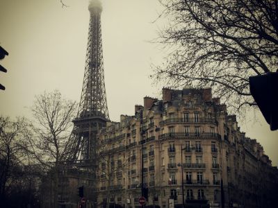
<img src="paris.jpg"
alt="Paris">
หมายเหตุ:ตัวอย่างนี้ใช้ไม่ได้กับแท็บเล็ตหรือโทรศัพท์มือถือ
เคล็ดลับ:ไปที่ บทช่วยสอน การแปลง CSS 3Dเพื่อเรียนรู้เพิ่มเติมเกี่ยวกับการแปลง 3D
ภาพพลิก 3 มิติพร้อมข้อความ
เรียนรู้วิธีการพลิกภาพ 3 มิติแบบเคลื่อนไหวพร้อมข้อความ:
ปารีส
เป็นเมืองที่น่าตื่นตาตื่นใจจริงๆ
ขั้นตอนที่ 1) เพิ่ม HTML:
ตัวอย่าง
<div class="flip-box">
<div class="flip-box-inner">
<div class="flip-box-front">
<img src="img_paris.jpg"
alt="Paris" style="width:300px;height:200px">
</div>
<div
class="flip-box-back">
<h2>Paris</h2>
<p>What an amazing city</p>
</div>
</div>
</div>
ขั้นตอนที่ 2) เพิ่ม CSS:
ตัวอย่าง
/* The flip box container - set the width and height to whatever you want. We
have added the border property to demonstrate that the flip itself goes out of
the box on hover (remove perspective if you don't want the 3D effect */
.flip-box {
background-color: transparent;
width: 300px;
height: 200px;
border: 1px solid #f1f1f1;
perspective:
1000px; /* Remove this if you don't want the 3D effect */
}
/* This
container is needed to position the front and back side */
.flip-box-inner {
position: relative;
width: 100%;
height: 100%;
text-align: center;
transition: transform
0.8s;
transform-style: preserve-3d;
}
/* Do an horizontal
flip when you move the mouse over the flip box container */
.flip-box:hover .flip-box-inner {
transform: rotateY(180deg);
}
/* Position the front and back side */
.flip-box-front, .flip-box-back {
position: absolute;
width: 100%;
height: 100%;
-webkit-backface-visibility: hidden; /* Safari */
backface-visibility: hidden;
}
/* Style the front side (fallback if
image is missing) */
.flip-box-front {
background-color: #bbb;
color: black;
}
/* Style the back side */
.flip-box-back {
background-color: dodgerblue;
color: white;
transform: rotateY(180deg);
}